 Kitchen AI

 Modern
 Scandinavian
 Japandi
 Modern farmhouse
 Industrial
 Quiet luxury
- Color decisions
- Small kitchens
- See it first
Are Black Kitchen Cabinets Too Dark?
Rarely from the color alone. What actually decides it is how much natural light the room gets, how much of the kitchen you make black, and how large the room is to begin with. We put the same matte black cabinets in a small galley kitchen with one window and in a large, sunlit room, so you can see the difference instead of guessing at it.

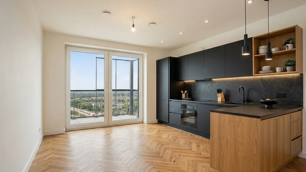
This kitchen appears twice more further down, once with a lighter finish in the exact same room, and once compared against the same black cabinets in a completely different room.
Free to try. No account needed.
Matte black looks good in nearly every kitchen photo you scroll past, which is exactly why it's hard to judge from photos alone. Whether it goes too dark in your own kitchen comes down to three things that never show up in an inspiration photo: how much daylight the room actually gets, how large the room is, and how much of the kitchen you're painting or ordering black rather than just the lower cabinets. We tested the same black cabinets in two real rooms at opposite ends of that scale, plus a lighter finish in the exact same room as the black one, to show what changes and what doesn't.
Room shape matters more here than most cabinet-color guides let on. A big open-concept kitchen with a dining area attached, common in newer US construction, tends to work in black's favor because there's so much surrounding light and floor space to balance it. A tight galley layout in an older building, common in city apartments, condos and pre-war houses, is closer to the worst case below. Know which one you're starting from before you commit to a color.
Same room, black next to a lighter finish
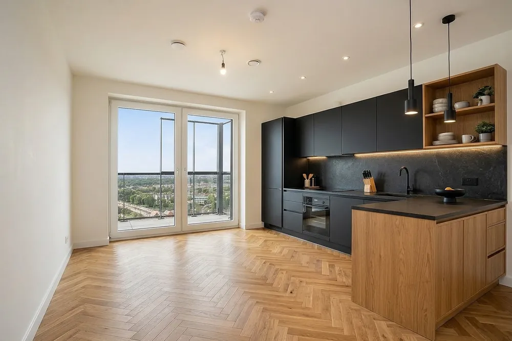
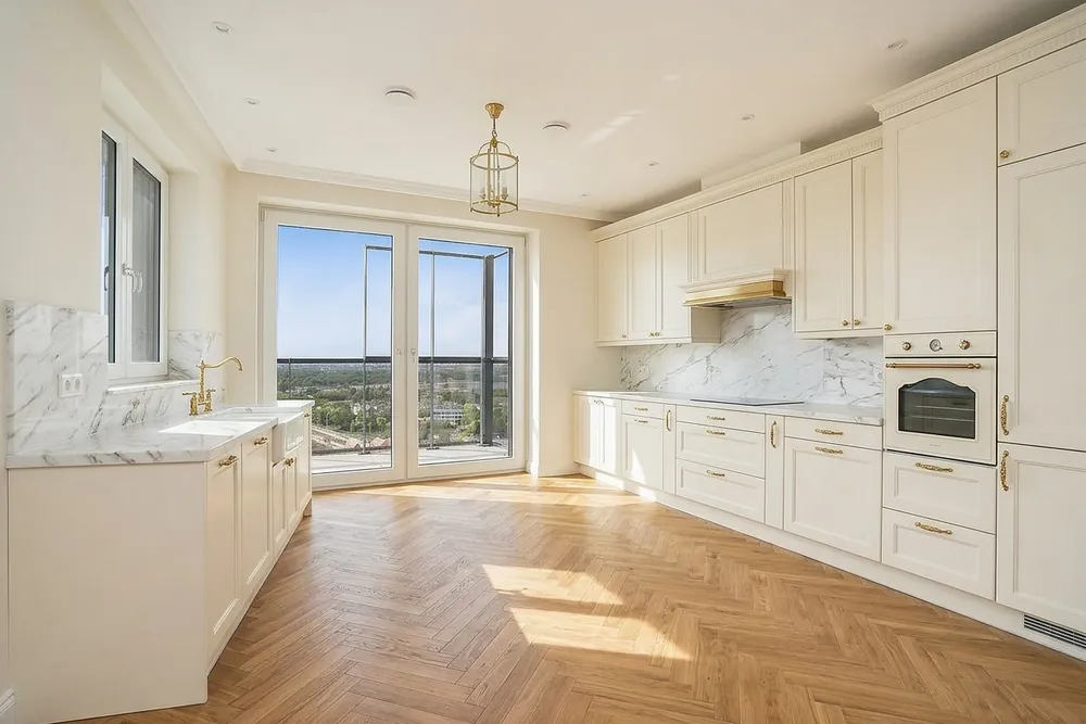
This is one narrow galley-style kitchen, photographed once with black cabinets, a black countertop and a dark backsplash, and once with cream cabinets, brass hardware and a white marble-look counter. What keeps the black version from closing in is the two runs of open oak shelving above the counter: they break up the black into sections instead of one continuous dark wall, and the wood tone gives the eye something light to land on at head height. Cover those same shelves with solid black uppers and this exact room would read noticeably darker, even though the cabinet color hasn't changed.
A small galley kitchen with one window
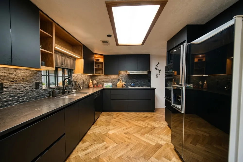
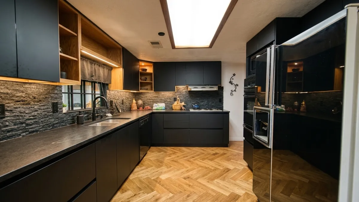
This is the room where black is the riskiest choice on this page. It's a narrow U-shaped galley with black cabinets, a black countertop and a black backsplash running down both sides, one window at the far end, and a skylight overhead for the rest of the light. Because the walls are close together and dark on three sides, the little daylight that does reach the room gets absorbed rather than bounced around, and the far end away from the window is visibly the darkest point in any of the six kitchens we've photographed for this app. If your kitchen has one window, no skylight, and is this narrow, this is close to the worst-case version of "black cabinets too dark," not the typical one.
The same black in a bright, open room
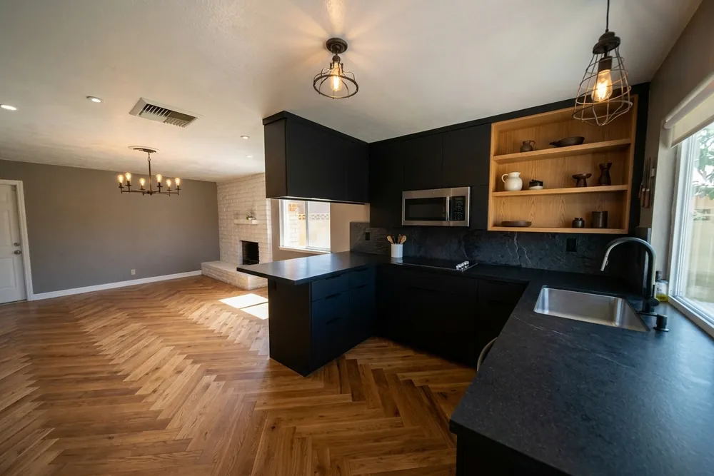
Same black, same finish, and a completely different outcome. This kitchen opens into a dining area with windows on two walls, so the black cabinets sit against meters of light floor, a light wall and daylight from two directions instead of one. The dark cabinetry reads here as one confident block of color in an otherwise bright room, which is the effect most black-kitchen inspiration photos are actually showing you, usually without mentioning how much window wall made it possible.
Line these two rooms up and the pattern is the same one we found testing cabinet colors against an oak floor in a different kitchen: it was never really about the color by itself. A tight, single-window galley and a two-window open room can carry the identical cabinet color to opposite results, so judge your own room's daylight and width first, and treat the color as the second decision, not the first.
How much of the kitchen should actually be black
The comparison above already hints at this: the galley kitchen with black on three full walls reads much darker than the same black cabinets would if only the lower cabinets were black and the uppers stayed light, or open like the oak shelving in the first pair of photos. Full black, floor to ceiling on every wall, removes every light surface at eye level in one move. Black lower cabinets with a light countertop, backsplash and upper cabinets keep two of the room's three horizontal light-catching surfaces, the counter and the wall above it, untouched, which is usually enough to avoid the closed-in feeling even in a room with modest daylight.
A workable middle ground for a dim or narrow kitchen: black on the lower cabinets and the island if there is one, a lighter or open upper cabinet, and a countertop or backsplash that isn't also black. That's roughly what separates the bright open room above from the galley kitchen, on top of the daylight difference.
Does a black kitchen hurt resale value?
Zillow's paint color research, published in June 2025 from a survey of more than 4,200 recent and prospective buyers, found that buyers offered about $1,597 more on average for a home with a dark olive green kitchen and roughly $3,915 less for one with a daisy yellow kitchen. Black itself wasn't one of the ten colors in that particular study, but the broader finding was that buyers preferred dark, saturated kitchen colors, green, blue, charcoal gray, over pale or bright ones, and disliked the brightest, least neutral shades regardless of which color family they came from. That points toward a well-finished black or near-black kitchen being a safer resale bet than a bold light color, though it's not a guarantee, and a kitchen that also fails on daylight, as the narrow galley above would, is a different problem than color alone. A real estate agent who knows your specific market and buyer pool will have a better read on your listing than any national color survey.
Black versus navy
Navy is the compromise buyers reach for when they want the drama of black without going fully dark, and it does behave differently in a low-light room: navy still absorbs light, but its blue undertone reads as less flat than true black once the room is dim, so a small or dark kitchen can look moody in navy where the same layout in black can look closed off. Against an oak floor specifically, navy's cool undertone contrasts with the floor's warmth the same way black does, so that part of the decision doesn't change between the two. If resale is the deciding factor rather than personal taste, Zillow's research points at both colors performing better than pale neutrals, so the choice comes down to how dark you actually want to live with day to day. Black and near-black cabinetry also shows up often in industrial-style kitchens, usually paired with stone or metal rather than the softer materials navy tends to get paired with.
What the app can't do
The app can't measure how many lumens your kitchen actually gets or tell you if a room this narrow will feel closed in; it works from a photo taken at one time of day, so a kitchen that looks fine in a bright afternoon shot might read differently on an overcast morning. It doesn't estimate resale value for your specific home, doesn't give a paint code, and doesn't move walls, windows or cabinets: the layout in your photo stays exactly as it is. Treat every result as an honest impression of the color and finish, not a guarantee of how the finished room will feel at every hour of the day.
See it in your own kitchen first
If your kitchen looks anything like the narrow galley above, one window and not much else, black is worth testing before you commit to it, not ruling out on principle. Photograph your kitchen at the time of day you actually use it, try black or navy against your own layout, and decide from that instead of from a photo of someone else's sunlit room.
Published September 1, 2026. The images in this article were made with Kitchen AI and are an AI impression, not a technical drawing. How we mark that.
I build Kitchen AI on my own: the app that shows your own kitchen in a different style. For these articles I test everything in real rooms, with real photos, and write down what happens. Something wrong, or missing? Let me know.