 Kitchen AI

 Modern
 Scandinavian
 Japandi
 Modern farmhouse
 Industrial
 Quiet luxury
- Color decisions
- White cabinets
- See it first
Off-White Kitchen Cabinets vs. White Cabinets
White and off-white look nearly identical on a paint chip and completely different once they're on real cabinets. We put a crisp white and a warm ivory through the same dated 1990s kitchen, kept the room, the layout and the light the same, and wrote down what actually changed.

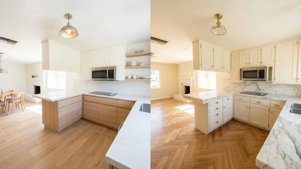
Same kitchen, same peninsula, same window, split down the middle. Left: a cool, flat-panel white. Right: a warm ivory with brass hardware and a herringbone floor.
Free to try. No account needed.
White kitchen cabinets read cool and crisp in almost any light. Off-white kitchen cabinets lean warm, with a trace of cream, beige or gray mixed into the base color. The real split between the two is undertone, not brightness: a true white keeps its own edge next to oak floors and brass hardware, while an off-white blends into those same warm tones instead of competing with them. We put both into the same dated kitchen to see the difference instead of guessing from a paint chip.
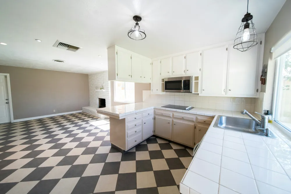
Most "white or off-white" roundups show two paint swatches next to each other, which tells you almost nothing about how either color behaves in a real room with real light and a real floor. We photographed one outdated 1990s kitchen, an open galley with a peninsula and a black-and-cream checkerboard floor, and ran two different whites through it while keeping the layout, the windows and the light exactly as they were.
White and off-white are not the same color
Paint brands sell dozens of whites, and almost none of them are neutral. A true white, like Sherwin-Williams Extra White (SW 7006), reflects light evenly and reads roughly the same color at nine in the morning and nine at night. An off-white almost always carries a second color mixed into the base: a touch of yellow for cream, a touch of gray for greige, a touch of beige for ivory. Benjamin Moore White Dove (OC-17) is the best-known example, a warm off-white with enough depth that it doesn't wash out next to cabinetry, countertops or a backsplash the way a stark white can.
That undertone is also why the two don't mix well in the same room. A cool white and a warm off-white sitting side by side, on an island next to perimeter cabinets, for example, will read as two different colors that don't quite agree, even though both are technically "white." Pick one lane and stay in it: if your countertop, backsplash or trim already leans warm or cool, match the cabinet to that, not to the word on the paint can.
Ivory, cream, greige: which off-white is which
"Off-white" is a family, not one color. Cream, ivory and greige all sit between stark white and beige, but they pull in different directions, and on a full run of cabinets the difference is easy to see. A useful number for sorting them is LRV, the light reflectance value: a scale from 0 (black) to 100 (pure white) that says how much light a color bounces back. LRV tells you how light a color is. It does not tell you the undertone, so you need both.
Cream has yellow in the base, which makes it soft and a little buttery. Sherwin-Williams Alabaster (SW 7008) is the common example: an LRV of 82 and a warm, yellow undertone, according to the PaintDB comparison with White Dove. Ivory is a white with a touch of beige or gray-yellow, more restrained than cream. Benjamin Moore White Dove (OC-17) is the usual pick here: Benjamin Moore lists its LRV at 83.16 and files it under its Off White Collection, and the same PaintDB comparison describes it as a softer, less creamy warm white than Alabaster. Benjamin Moore Swiss Coffee (OC-45) sits close by, at an LRV of 81.91, described by the brand as "just the right amount of warmth."
Greige is gray mixed with beige, and it is where "off-white" stops being accurate. Sherwin-Williams Accessible Beige (SW 7036) has an LRV of about 58 on the Sherwin-Williams color page (57.67, rounded). Against the low 80s of the creams and ivories, that is a visibly darker color. On a wall it reads as a soft neutral; on cabinets it reads as beige, not as white. If you want the warmth without the weight, stay in the low 80s.
| Family | Example | LRV | Undertone |
|---|---|---|---|
| Stark white | Sherwin-Williams Extra White (SW 7006) | 86 | Clean, near neutral; some reviewers see a faint cool lean |
| Cream | Sherwin-Williams Alabaster (SW 7008) | 82 | Warm, yellow |
| Ivory | Benjamin Moore White Dove (OC-17) | 83.16 | Warm, muted yellow |
| Warm white | Benjamin Moore Swiss Coffee (OC-45) | 81.91 | Soft warmth |
| Greige | Sherwin-Williams Accessible Beige (SW 7036) | about 58 | Beige with gray, warm |
Two cautions. First, LRV differs by source: many blogs list White Dove at 85, while Benjamin Moore itself lists 83.16, so trust the manufacturer's number when you can. The Extra White value of 86 comes from a Julie Blanner paint review, not from Sherwin-Williams. Second, a gap of two or three LRV points is too small to see on a wall; undertone and the light in your room matter far more. Paint a large sample on the cabinet or a board and look at it morning and evening before you commit.
A quick way to choose between the families: match the family to the warmest thing you cannot change. If that is a honey-toned oak floor or an existing cream tile, a cream or ivory sits comfortably next to it. If it is a cool gray stone or a gray floor, a muted ivory is as far into the warm range as you can go before the room starts to argue with itself, and a stark white is often calmer. Greige only makes sense when you actually want a color, closer to a taupe, rather than a light cabinet.
The same kitchen, two different whites
For this piece we ran the same kitchen through six cabinet finishes to find one genuine white and one genuine off-white without repeating the greens and blacks we'd already covered on this site. Four of the six read as wood tone, sage green or black once they were actually on the cabinets rather than described in a style name. Only two held up as convincingly "white": a flat-panel cool white and a traditional raised-panel ivory. Those are the two in the hero photo above and below.
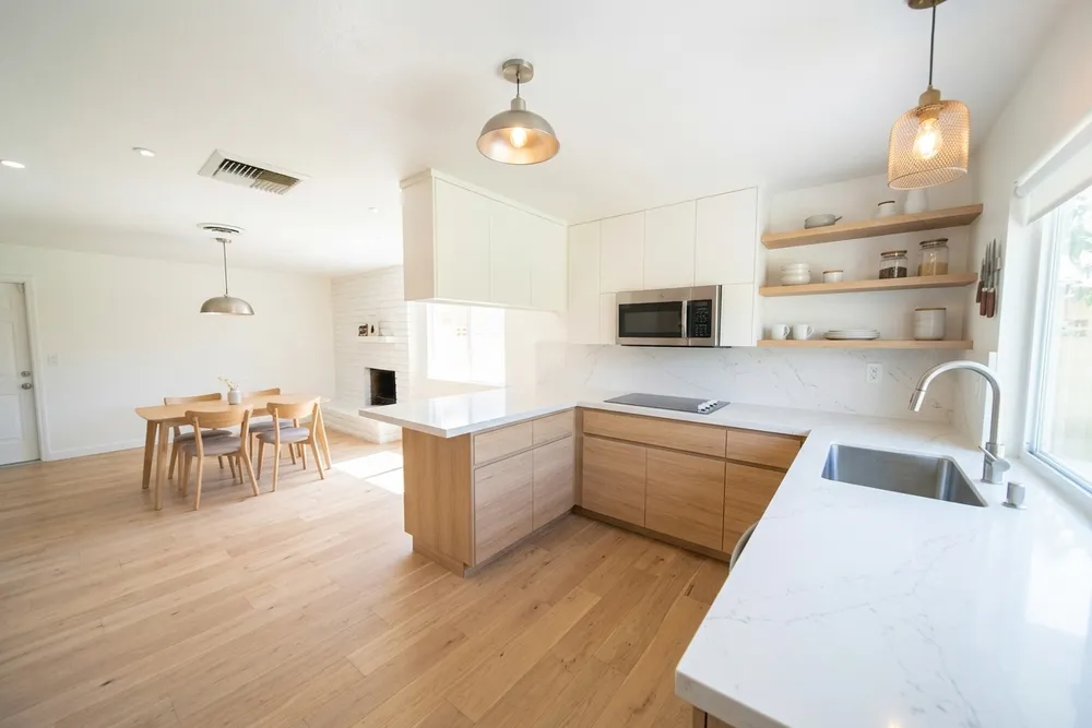
The white cabinets keep their own identity here. Against the wide-plank floor and the open oak shelving, the contrast is obvious and the kitchen reads clean and current. Nothing about the cabinet color pulls toward the wood; it sits next to it as a separate, cooler element. That's the effect a true white is for.
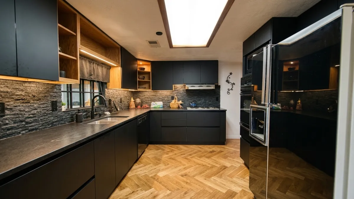
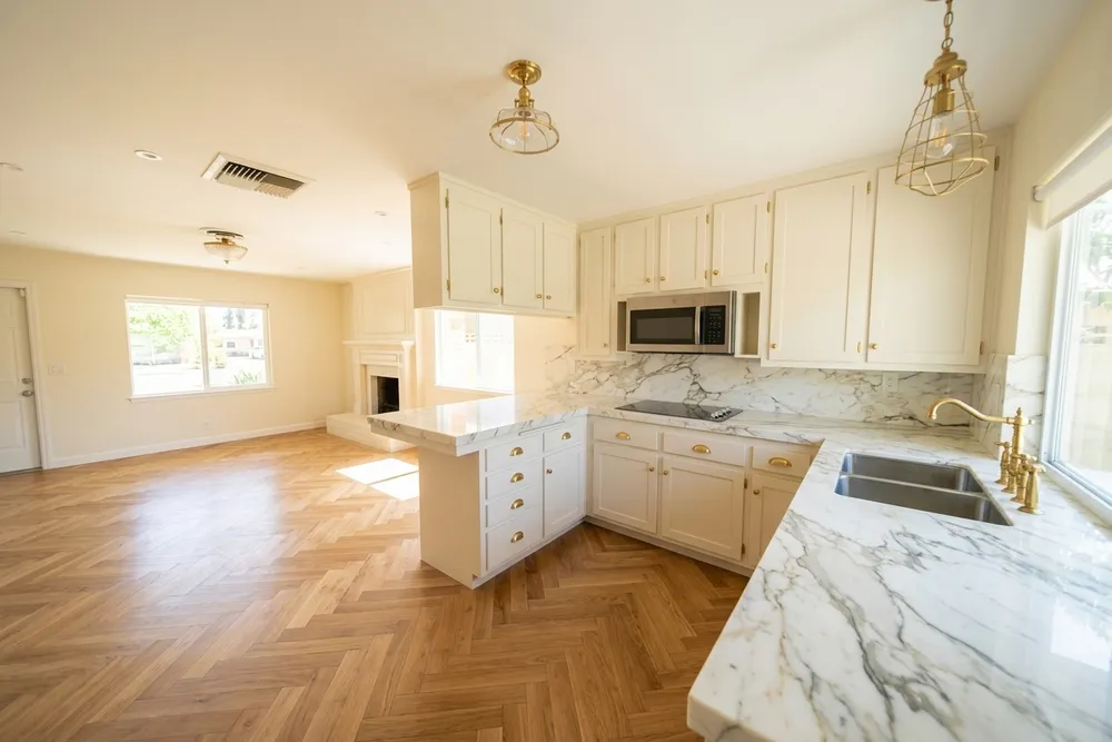
The ivory version, on the hero image at the top of this article, does the opposite. Traditional raised-panel doors, brass hardware, a marble backsplash and a herringbone floor all lean into the same warm family as the cabinet color, so the whole kitchen reads as one warm palette instead of white-against-wood. Swap in a cool white here and the brass and the marble veining would suddenly look slightly at odds with the cabinet, the same clash described above.
Stark white vs. off-white on the cabinet
Stark white and off-white differ in three places you notice once the cabinets are in. The first is contrast with everything else that is already white. A stark white cabinet next to white trim, a white ceiling or white appliances either matches them exactly or looks slightly off, and there is little middle ground. An off-white reads as a deliberate shade, so a small mismatch with the trim looks like a choice instead of a mistake.
The second is the countertop. White quartz and many marbles are bright and fairly cool, and a stark white cabinet repeats that brightness: the kitchen reads as one clean, high-contrast surface. A warm off-white cabinet next to a bright cool top can make the top look harder and the cabinet look a bit dingy, so with off-white you want a countertop that leans warm or carries visible veining, as in the ivory kitchen above. The third is how much the finish and shadows show. Stark white flattens door profiles in bright light and shows every scuff, while off-white keeps a little shading on the raised edges.
So stark white is the better call when you want a crisp, gallery-like kitchen, you have cool stone, steel appliances and consistent north light. Off-white is the better call when you have warm flooring, brass or bronze hardware, existing cream trim, or a kitchen with strong afternoon sun. If you are still unsure after that, the safest test is the one in the photos above: put both on the same cabinets in your own room, because the floor and the light decide it more than the paint name does.
Which one fits your light, floor, and hardware
A north-facing kitchen with little direct sun stays close to true white all day, which is exactly where a cool white looks its best; the same cabinet in a west-facing kitchen with strong afternoon sun can start to look slightly blue or gray by comparison, because there's nothing warm in the room to balance the light. An off-white is more forgiving in changing light, since its built-in warmth reads as intentional rather than as a lighting problem.
Your existing floor and hardware matter as much as the light. A warm oak or honey-toned floor, like the one in both photos above, pairs naturally with an off-white; the same floor under a stark white can look slightly mismatched unless something else in the room, a countertop or backsplash, is also cool enough to justify the contrast. We tested this same undertone question against several bolder colors, not just white, in kitchen cabinet colors that work with oak floors, and the pattern holds: warm floor, warm cabinet, calm room; warm floor, cool cabinet, a room that needs a cool anchor somewhere else to work.
Hardware follows the same logic. Brass and warm gold pulls sit naturally on an off-white door and can look slightly yellow against a stark white. Brushed steel, matte black and chrome all read as neutral enough to work with either, which is why they show up more often on true white cabinets. If you're leaning toward a specific overall look rather than starting from the color alone, the modern kitchen style guide covers what pairs with a crisp white, and the modern farmhouse kitchen style guide covers the warmer, off-white end of the same decision.
Off-white cabinets in a modern kitchen
Off-white does not mean traditional. The door style decides that. In the two kitchens above, the flat-panel white reads modern and the raised-panel ivory with brass reads traditional, even though both are light, quiet colors. Put a warm off-white on slab or flat-panel doors with no applied molding and the same color reads calm and current instead of classic. If you are choosing modern off-white kitchen cabinets, start with the door, then the color.
Handleless cabinets, with finger pulls or a recessed channel instead of knobs, make the color do more work, since there is no hardware to break up the surface. That favors the muted end of the range. White Dove, which comparison sites describe as softer and less creamy than Alabaster, is a safer starting point than a yellow cream, which can look heavy across a long, plain run of doors. A matte or satin finish also keeps a flat door from looking like laminate from an earlier decade.
Contrast is what keeps an off-white modern kitchen from going soft. Black or dark bronze hardware, a matte black faucet, a dark stone or honed black countertop, or a walnut-toned island each give the pale doors an edge. Pick one or two, not all of them: a black countertop with black hardware and black lighting starts to read as a black kitchen with white cabinets in it. If you are leaning that way, the modern kitchen style guide covers the full material palette.
Flat doors also show undertone more than detailed ones. A raised or shaker door breaks up the surface with shadow lines, which hides a lot of the color. A flat slab is one uninterrupted plane, so a slightly yellow off-white looks yellower across it, and a slightly cool one looks colder. That is the reason to test the sample on a flat board and in the real light of the room, not on a small card.
One practical point on handleless kitchens: the app lets you change door style separately from color, with five door styles including flat, so you can see the same off-white on a flat slab and on a shaker door in your own room before choosing. It shows an impression of the finish, not a paint match, as noted below.
Fingerprints, upkeep, and what's actually trending
Beyond how it looks, the two colors live differently day to day. A stark white shows fingerprints, grease and dust in a way an off-white simply doesn't, because there's no undertone to visually absorb the smudge. Off-white also tends to hide a slightly uneven paint touch-up better than a stark white, which shows the seam where an old can of paint meets a new one.
| White | Off-white | |
|---|---|---|
| Undertone | Neutral to cool | Warm: cream, beige or gray mixed in |
| Best light | North-facing, consistent daylight | Any light; more forgiving of warm sun |
| Pairs naturally with | Steel, matte black, cool stone, oak plank | Brass, gold, warm marble, herringbone wood |
| Shows fingerprints | More visibly | Less visibly |
| Share of 2026 kitchen remodels | 28% | 15% |
Neither color is going out of style. According to the 2026 U.S. Houzz Kitchen Trends Study, fielded in July 2025 among homeowners who had recently remodeled or were about to, white cabinets accounted for 28% of kitchen renovations and off-white another 15%, together still the single largest color category even as wood-tone cabinets edged narrowly ahead of white alone for the first time. If you're worried that off-white reads as dated, the data says otherwise: it's a stable minority choice, not a fading one. The full picture of where off-white is headed, and where it still reads dated, is in are off-white kitchen cabinets still in style.
What the app can't do
The app can't give you a paint code or a specific product name for either white; it works from a photo and shows you a material, not a swatch you can hand to a painter. It doesn't simulate how a color shifts across different times of day in your specific kitchen, since every render is based on the lighting in the photo you upload, and it doesn't move cabinets, walls or windows: the room's layout stays exactly as you photographed it. Treat every result as an honest impression of the undertone and finish, not a guarantee of the exact paint match.
See both in your own kitchen first
A paint chip under store lighting won't tell you whether your kitchen wants a cool white or a warm off-white; your own floor, hardware and window direction decide that. Photograph your kitchen, try both, and pick the one that agrees with what's already in the room instead of guessing from a 2-inch swatch.
Published September 4, 2026, updated October 4, 2026. The images in this article were made with Kitchen AI and are an AI impression, not a technical drawing. How we mark that.
I build Kitchen AI on my own: the app that shows your own kitchen in a different style. For these articles I test everything in real rooms, with real photos, and write down what happens. Something wrong, or missing? Let me know.