 Kitchen AI


 Modern
 Scandinavian
 Japandi
 Modern farmhouse
 Industrial
 Quiet luxury
- Color guide
- Sage green
- 2027 trend
Sage Green Kitchen Cabinets: A Color Guide for 2027
Sage green cabinets are a good 2027 choice when you pair them with warm wood and a white or cream countertop. Here is one kitchen in four colors, and a table for matching the shade to your light, your counters and your wood.

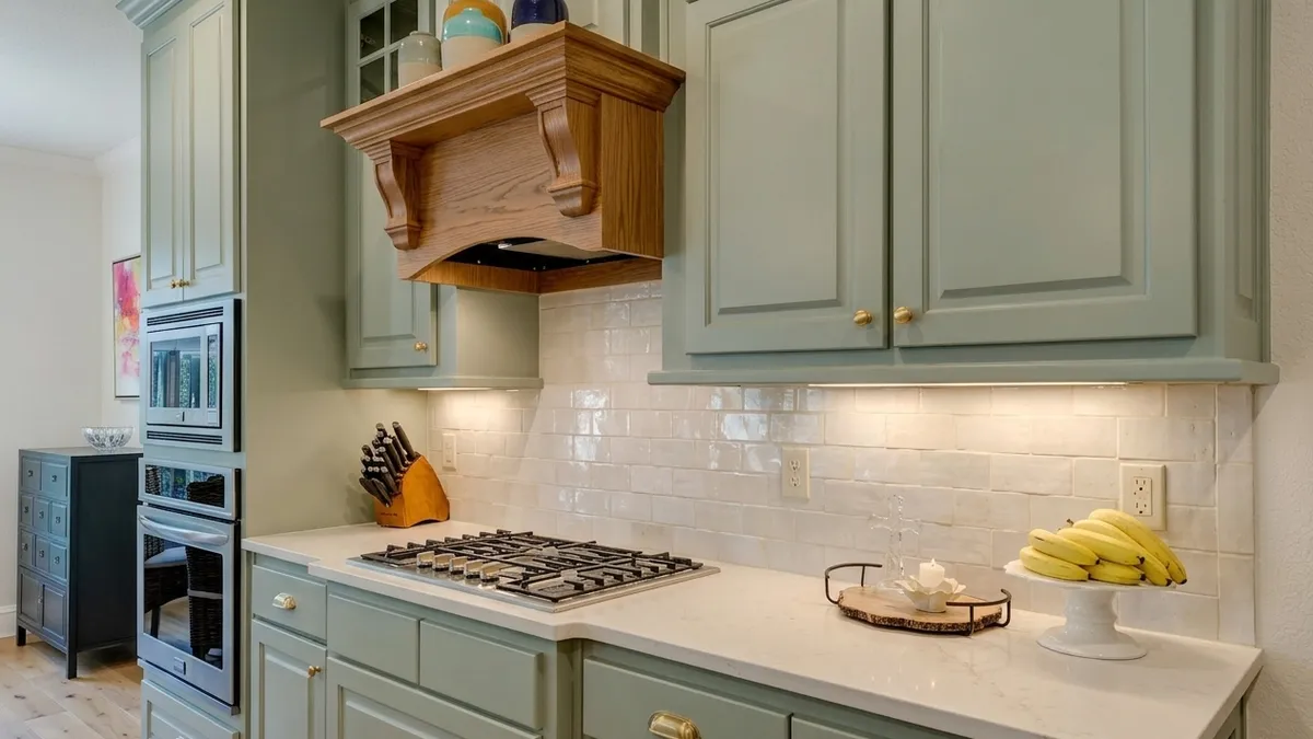
The sage version of the test kitchen. Every other color in this guide starts from the same photo, so the cooktop, the oven column and the hood stay where they are.
Free to try. No account needed.
Yes, sage green kitchen cabinets still make sense for 2027, and they look best with warm wood and a white or cream countertop. Choose the shade by your light: a grayer sage for bright rooms, a softer, yellower one where daylight is thin. Dulux named sage its 2027 color, and two US brands picked greens too.
Is a sage green kitchen a trend for 2027?
Green is, and sage is one version of it. In September 2026 the paint brand Dulux named Soulful Sage its Colour of the Year 2027, a soft, silvery gray-green (Dezeen, September 2026). Dulux is sold mostly outside the US under that name, so the American picks matter more here. Behr announced Grounded, a muted olive green, on August 26, 2026, and Sherwin-Williams followed on September 15, 2026 with Celery, a soft green with yellow undertones (reported by Homes & Gardens, 2026). Three different greens, all chosen within about three weeks.
Colors of the year are what a paint company wants to sell next, not sales data. The cabinet numbers come from the Houzz 2026 U.S. Kitchen Trends Study, published in January 2026 from a July 2025 survey of 1,780 Houzz users (Houzz; the green and island figures as reported by the National Association of Realtors). Among renovating homeowners, wood-tone cabinets led at 29% and white followed at 28%. Among people who wanted a color, green at 6% overtook gray at 5%. For islands, a wood countertop took first place at 39%, with white second at 19%.
Read those honestly. Six percent is a small slice, so sage is a minority choice that is gaining, not the new default. But the two things that lead the survey, wood and white, are exactly what sage cabinets are usually paired with. That is why the combination feels current instead of risky. If your question is really whether cream and off-white still hold up next to all this, that has its own article.
The same kitchen in four colors
The test room is one wall of a kitchen: a single straight run of cabinets with a gas cooktop, a tall column on the left holding a stacked microwave and oven, a hood above the cooktop, and two wide upper doors to its right. We ran four looks through Kitchen AI from one photo. The sage version is the picture at the top. The other three follow, after the starting point.
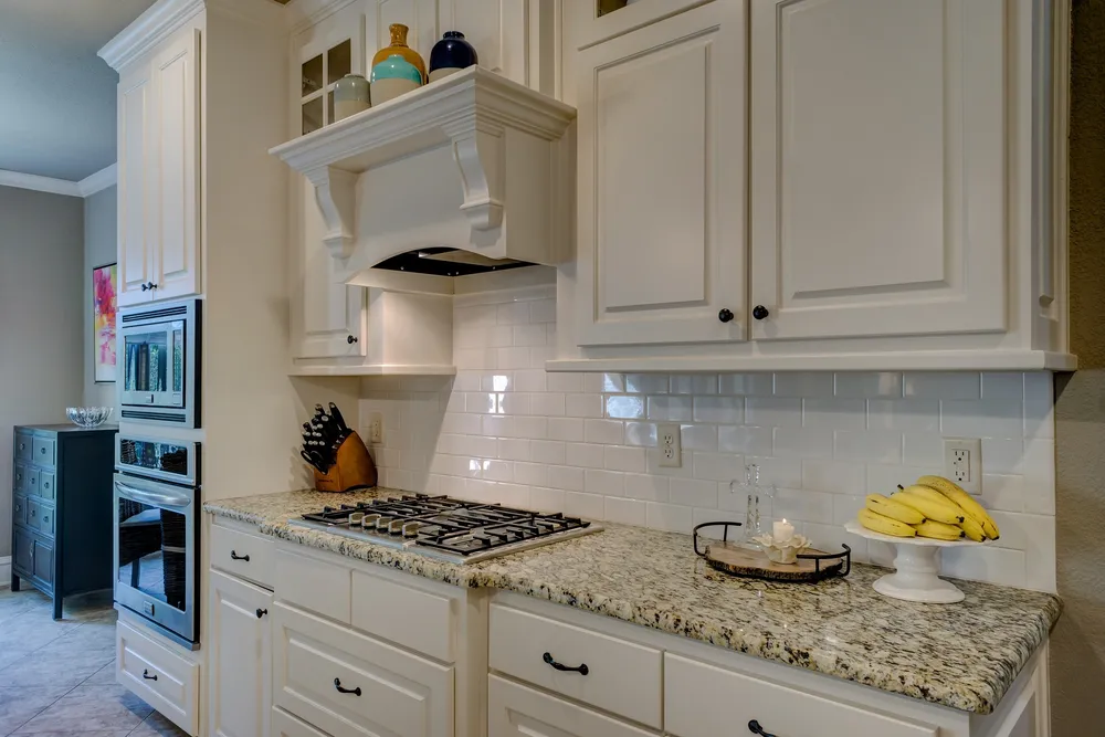
One caveat before the comparison: this is not a clean paint test. The app changed more than the cabinet color each time. In the sage version it also gave us brass knobs and cup pulls instead of black ones, an oak hood instead of a painted one, glossy irregular cream tile instead of subway tile, a white stone-look countertop with soft gray veining instead of granite, and a light oak plank floor. The darker walls became cream. What never moved: the cooktop, the oven column and the position of the hood. So read the images as four complete looks, not as four paint chips.
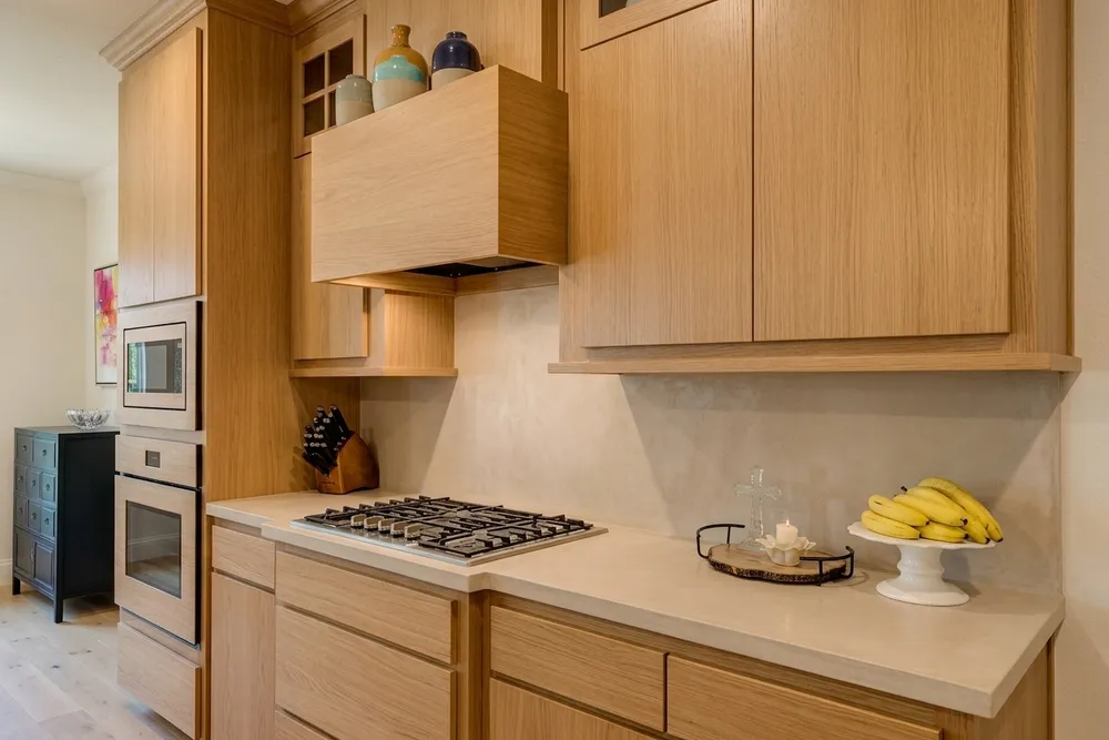
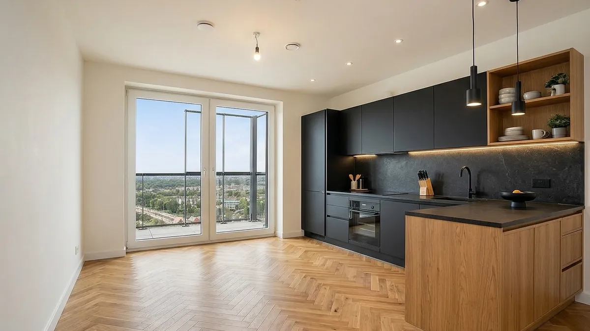
Oak and plaster. This is the Japandi direction: flat oak doors with no visible hardware and a plaster-look backsplash that meets a beige countertop. Everything sits in one narrow tan range, so the run reads as a single material rather than as cabinets plus counters. It is calm, and it is the least colorful of the four. If that is your direction, the Japandi kitchen guide covers the rest of the palette.
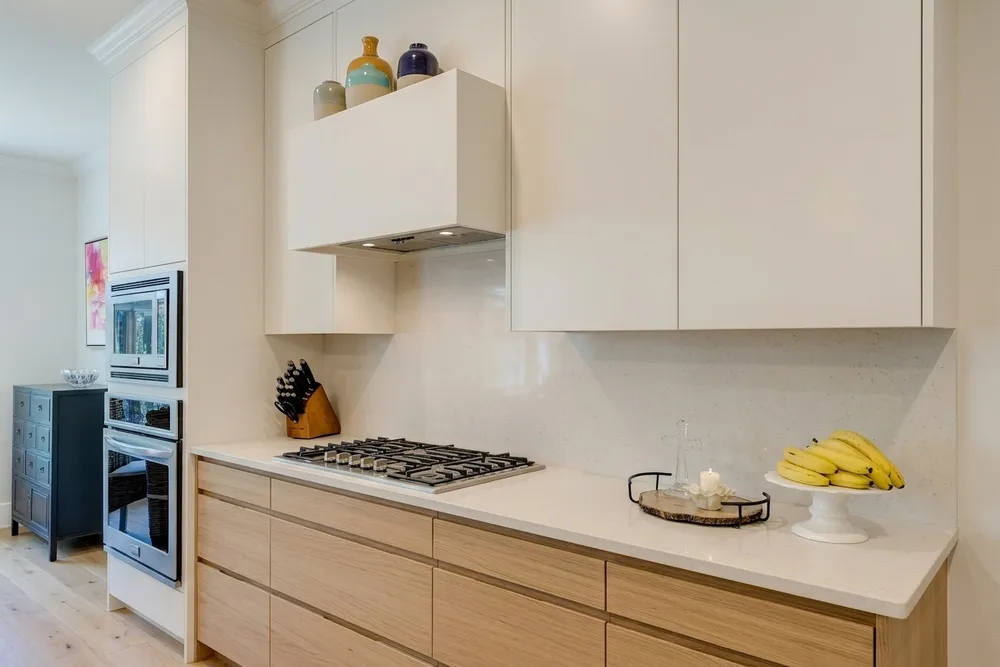
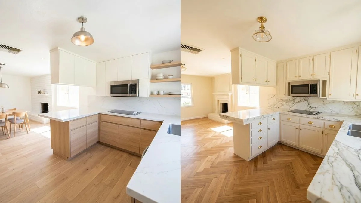
White above, light oak below. Flat white uppers and a boxed white hood sit over light oak drawers with horizontal grooves, a white speckled stone-look countertop and a slab backsplash in the same stone look. This is the two-tone formula that matches the Houzz numbers, with wood and white sharing the room. Of the three alternatives it is the one closest to sage in mood, because the countertop is just as light.
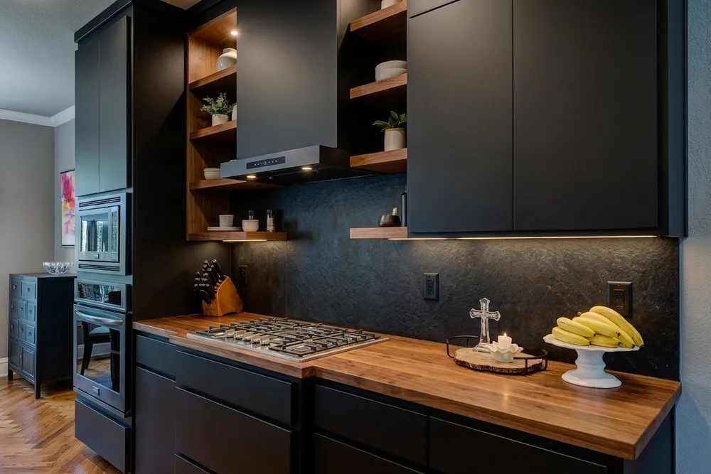
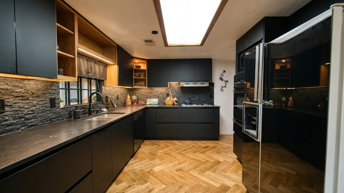
Black with walnut. Matte black slab doors, open walnut shelves, a walnut-look butcher-block countertop, a dark textured backsplash and a herringbone floor. It is the most dramatic version and the one where the room's light matters most. If you are weighing it, black cabinets and darkness gets its own treatment.
What the sage did differently. Wood appears in all four. In the sage version it shrinks to one piece, the oak hood, plus the floor, and that hood becomes the warmest thing in the picture and the first place the eye lands. In the other three, wood is a main surface instead of an accent. Sage also leaves the countertop and tile as the lightest things in the room, so the color has to carry the whole kitchen alone. At this size the green reads gray-green rather than minty.
Which sage for which light?
We rendered one sage in one room, so the table below is judgment from how color generally behaves, not a measurement from our test. The rule of thumb behind it: cooler daylight pushes a green toward gray, warm bulbs and southern light push it toward yellow, and a color that looks right on a chip often looks darker once it covers a whole wall of cabinets.
| Sage shade | Light it likes | Countertop | Wood | Watch for |
|---|---|---|---|---|
| Gray-green, silvery (close to how Dulux describes Soulful Sage) | Bright rooms with plenty of daylight | White or cream stone-look with soft veining | Light and medium oak | Can read cold and flat in a dim room |
| Soft yellow-green, warm | Dim or north-facing rooms | Cream or warm white | Honey oak, walnut | Looks muddy against a stark blue-white counter |
| Deep, dusty sage, near olive | Large, bright kitchens | Honed light stone, butcher block | Walnut, darker wood | Nearly black in a small, dim room |
| Pale sage, almost neutral | Almost any light, small kitchens | Any white | Any tone | Can look like dirty white beside bright white trim |
What goes with sage green cabinets?
White countertops. This is the pairing the top photo uses, and it works because the stone-look top is cream-leaning white with soft veining instead of a blue-white. Stark white next to sage can make the green look dull. If you are choosing between white and cream for the top or the tile, white versus off-white in the same kitchen shows how different they read.
Wood. Sage cabinets with wood is the most reliable pairing in the set, and it comes in three scales: a single piece such as the hood or open shelves, a butcher-block countertop, or the floor. Keep the wood warm. In our render, the oak hood against the green looks intentional, where a gray-toned wood would have looked like a mistake. We also tested a darker green against an oak herringbone floor in kitchen cabinet colors that work with oak floors.
Hardware and tile. Brass suits sage: the knobs and cup pulls in the sage render echo the hood's warm wood. Black hardware would sharpen the look. The cream tile in that render is glossy and slightly uneven, which keeps all that pale surface from feeling flat.
Door style. The sage we rendered has raised-panel doors, which lean traditional. We did not render a flat-front sage, so the claim that it feels more modern is a guess, not a result. If you lean that way, modern farmhouse is the style page closest to what the sage render shows, and all six kitchen styles are one tap away.
When sage is the wrong call
In a kitchen with little daylight, sage drifts toward a flat gray that makes the room feel tired, and a darker sage can slip toward black. A cool, gray floor can also fight a warm, yellow-leaning sage. And if you are choosing cabinets mainly for resale, a tested neutral is the safer path: nothing above suggests sage is mainstream yet, only that it is rising. That is a reason to see your own kitchen first, not a reason to skip the color.
What the app can't do
The images here are an AI impression. Screen color is not paint color, and the app does not give you a paint code or a sample to hold up to your cabinets. It will not tell you how a shade shifts through your day, and it will not move walls, windows or appliances: the room's layout stays as photographed. As the comparison above shows, it may also change surfaces you did not ask about, so check the countertop, floor and hardware in every result before you decide. Brush out a real sample before you commit.
Try your sage before you buy a sample
Cabinet color, countertop, backsplash, flooring, wall color and hardware are chosen separately in Kitchen AI, so you can try sage and leave your floor alone. Take one photo in the light you actually cook in, run the green against your own countertop, and then pick two or three shades to sample on the wall. More full-room examples are on the before and after page.
Published October 4, 2026. The images in this article were made with Kitchen AI and are an AI impression, not a technical drawing. How we mark that.
I build Kitchen AI on my own: the app that shows your own kitchen in a different style. For these articles I test everything in real rooms, with real photos, and write down what happens. Something wrong, or missing? Let me know.